Hello,
I have named the screenshot “OO QAT”, to see what QAT I’m talking about.
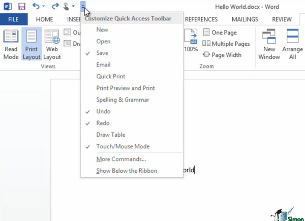
I have named the screenshot “Customize Quick Access Toolbar”. This window for customizing QAT could be made in OO like it is in MS Office or the development team can make something similar to this.
a. Option to add and hide QAT(Quick Access Toolbar) icons.
b. Option to rearrange QAT icons.
c. Add an option to QAT drop down menu. This is also available in MS office. I have named the screenshot “QAT drop down menu”.
d. Show QAT below/above the ribbon
You can ignore the red circles in the screenshot “Customize Quick Access Toolbar”.
Thanks


Hello @nicesto
It seems that this topic is similar to your another one: Option to customize toolbar in OO desktop editors
The idea itself is very similar. We are working on the toolbar customization already. Unfortunately, I can’t provide any details at the moment.
This suggestion is for Quick Access Toolbar. I have sent the screenshot again named “OO QAT”.

As I mentioned in your other thread we are working to provide customization feature for editor toolbar. There is still a lot of work ahead and I don’t know in what form it will be implemented at the moment. The ‘quick access toolbar’ is a part of toolbar in general, and we are working on that too.
Hi,
what about the status? In addition, is it available in the web version?
Hello @softboy99
Unfortunately, we are still working on the mentioned feature. We will update this thread once we have something to share.


