Bug or feature ? Line spacing type can lead to masked picture

Hello
Here is an issue that I face with OO but which also happens when the file is opened with LO.
I have a text with a picture.
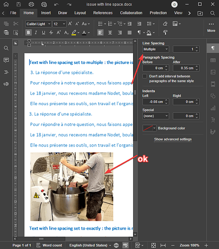
When line spacing is set to multiple, everything is fine:

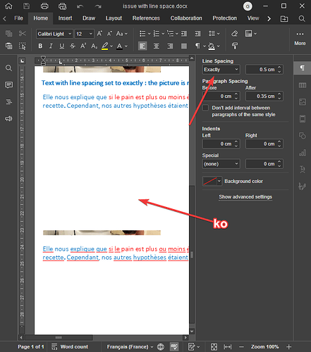
However, when I set it to “exact”, the picture is partially masked:

why :frowning:
Using a special font and a notebook-like background (with lines & all), I need both and this is complicating my life.
issue with line space.docx (1.3 MB)

Thanks for your answer.

Hello @arcqus

May I ask you to provide exact scenario on how to reproduce the issue in given file?
It seems that there is simple solution to this situation - you can set Wrapping style to Square or In front of text, for instance, and image will be visible.

Hello Constantine.
You are right, i can change the wrapping style… but it is way less handy afterwards to manipulate the image and keep the document layout (when you move the image, sometimes, part of the text is over, or bellow, and you have to make multiple tries before getting the layout you want, layout that can be crushed as soon as you add some text.
Having the picture that behave like text is the handier way to manipulate it… and above all, why an inconsistent behaviour related to line spacing ?
Thanks.

To get more details on root of the issue, I’m still asking you to provide following scenario:

Mostly, I am interested in how to transform the first part of document in the same way to reproduce the behavior of the second part.

Hi @Constantine,
Like @arcqus, I have sometimes struggled with images within the document flow, and he has raised an interesting issue with Exact Line Spacing, and maybe something that I was trying maybe of assistance in illustrating the issue.

With the document text Line Spacing → Exactly 0.5cm;
I got the following display, which I would not have expected.

Screenshot 2024-01-31 220656

Prior to the screen-shot, I clicked on the residue of the image so that it is apparent what is happening to the image which has the default Wrapping Style → In Line with Text

Interestingly, the only visible part of the image is the bottom 0.5cm, the remainder of the image has been covered over by the preceding text and margin. The image’s sizing handles are visible going up and under the preceding content of the document.
Note that the only part of the image that is visible is the size of the Line Spacing.

I would have expected that the Line Spacing value would apply to the space below the image, as it does with the preceding document content.

The default Line Spacing → Multiply displays the image in its entirety with the default Wrapping Style, and so does Line Spacing → At Least.

Once one starts setting Wrapping Style for an image, it can be a little difficult to wrestle the image back in position it is needed, as it is detached from the paragraph it was originally inserted into, and dragging the image to its desired position is a bit “hit and miss” as no insertion bar is visible during the image move to indicate where to place the image.

And, there is no apparent option to set a style for an image, so each image has to be individually set for margins/spacings. On a document with multiple images, this could be a little tedious.

For @arcqus, an interim solution may be using “At Least” instead of “Exact” for Line Spacing, but I would suspect that image behaviour in “Exact” Line Spacing is not behaving as expected. Certainly not how I would expect.

I hope some of this may be of help in identifying the issue at hand.

Hi David
Thanks for the detailed description of my issue :slight_smile:

@Constantine : is it sufficient for you ?

Hello @DavidRGreen, thank you very much for providing the details.

@arcqus, yes, this is indeed an informative explanation. We will take a closer look at this issue and I will provide feedback.

Hello @arcqus @DavidRGreen

I’ve found out that this behavior is expected. Since Wrapping Style of images is set to In Line With Text - it causes such effect when used in combination with Line Spacing > Exact.
Basically, the objects in the paragraph with exact line spacing inherit the height from that parameter as well and the rest of an image is not displayed, i.e. is cut. The solution, as I mentioned in my initial response, is to use another Wrapping Style for an image, e.g. Square.

As far as I know, the same behavior appears to be in many other documents processors.
have you seen any other ways of how Exact parameter works with images?

Hi Constantine,
As mentioned in my first post, it is indeed the same in LO.
I just think it’s a bit awkward and wanted to knew if it was possible to do better (in my point of view ;-))
If it is not, so be it :-).

1 Like

Admittedly, I rarely use “exact” when it comes to type leading. And after doing a few tests in MSWord, did realise that the behaviour is the same. I still think it is rather odd approach to formatting, and I am at a loss as to why it is the way it is.

But consensus rules. And it has been an education.

May I know what is expected behavior of interaction of Exact line spacing of a paragraph and image in this paragraph from your point of view?

Hello @Constantine
What I wish (but I haven’t thoroughly considered the case) is that the picture would be visible, not just a slice of it (but again, I don’t know if it is consistent).
For now, I’ll just use existing picture wrapping options.

1 Like