I can only see the first line and scrolling down is impossible since the page force-scrolls back up
IOS 18
Can’t attach an image as the form gets stuck and can’t be sent
I can only see the first line and scrolling down is impossible since the page force-scrolls back up
IOS 18
Can’t attach an image as the form gets stuck and can’t be sent
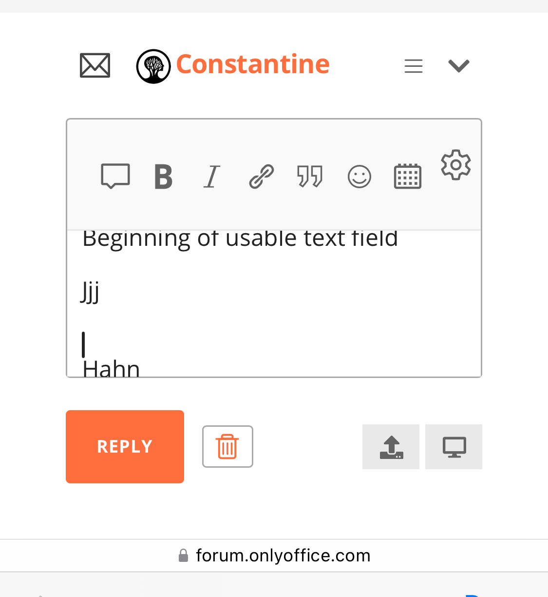
The reply field also can’t be scrolled down, but at least it first have a bunch of fields at the top obscuring it
Can I not edit my own posts/comments on this forum???
Anyway, all content blockers are off
Hello @esv
What browser do you use? Did you change any zoom levels for page or in iOS settings? I’ve checked Safari and everything seems fine. By the way, do I understand that you are running developer beta of iOS 18?
Editing of posts is not available for new users.
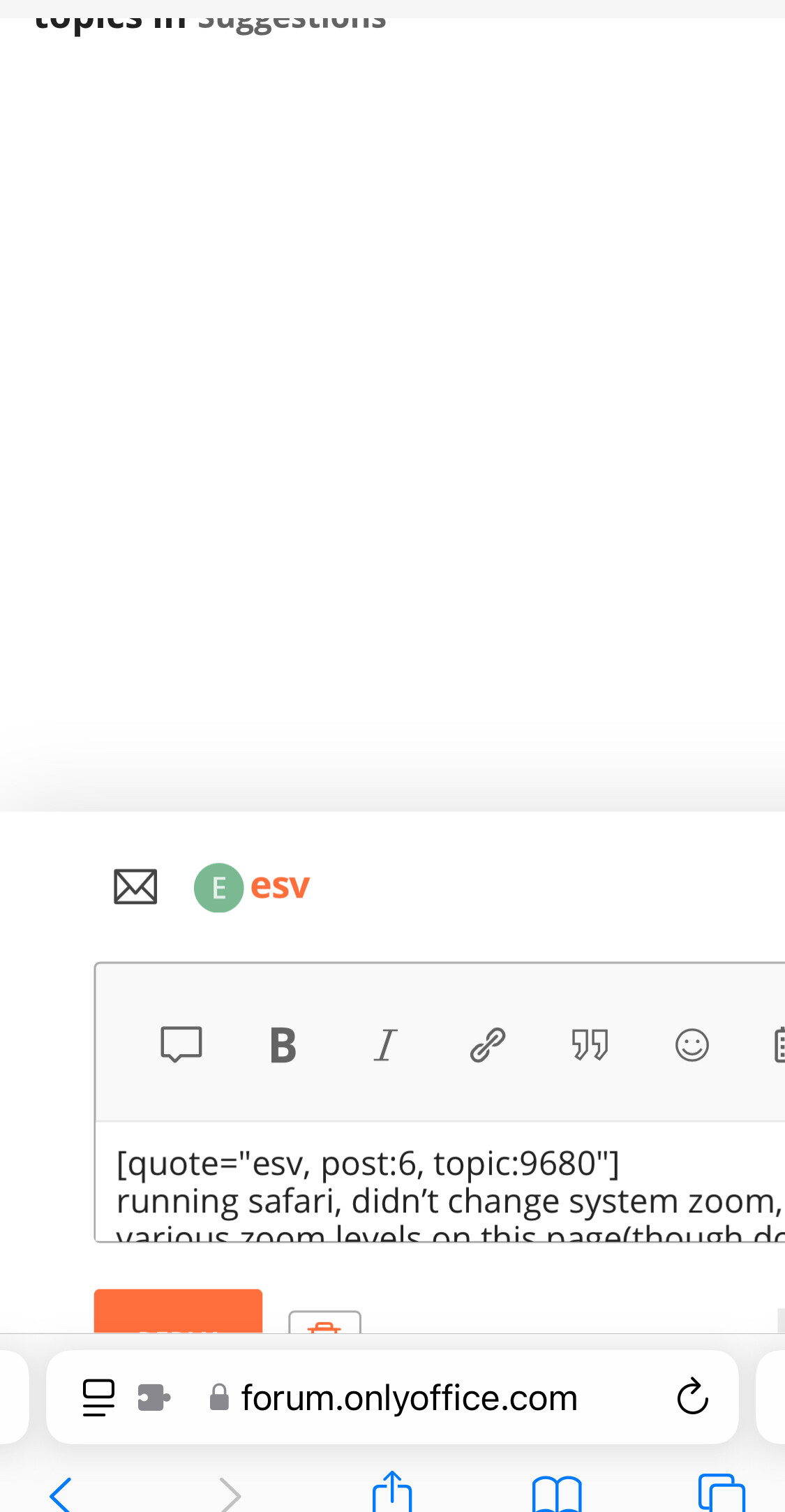
I’m running safari, didn’t change system zoom, tried various zoom levels on this page(though don’t think I’ve changed them before)
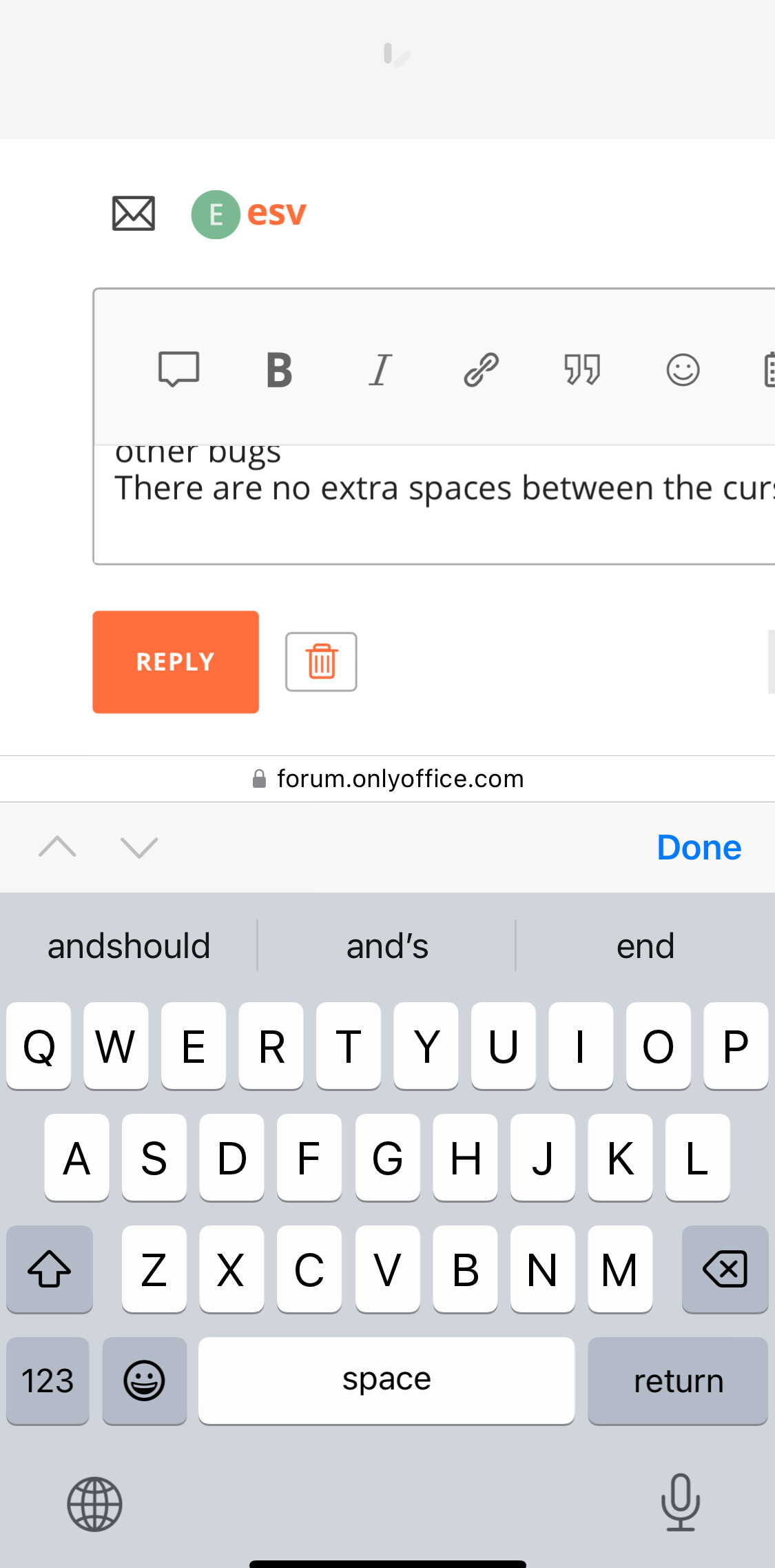
Now at smaller.com I just get other bugs
There are no extra spaces between the cursor and the last text
Yes, it’s iOS 18 dev
correction: at smaller sizes (hard to correct typos
when you can’t see the text nor
edit)
May I ask you to check any other browser too, e.g. Chrome? We are not aware of any changes that might persist in dev beta of iOS so we cannot check it until official release.
I’d be nice to have screenshots of your whole screen when accessing forums via Safari, video demo would be perfect.
This is Chrome, reply
maybe something is wrong with the floating type style? Don’t remember seeing any forms bugging like this
I cannot reproduce this issue in Chrome. No matter what direction I am scrolling the page, it stays in place. If I there is any additional info, please feel free to share.
As for the zoom value (initial post): please share video demo from Safari too, as it seems to be related to this browser, because in Chrome as I can see it is displayed fine.
But that’s exactly the problem, it shouldn’t stay in place and obscure the text input field.
Your form has needlessly huge margins, also at the bottom, which also force themselves to be at the bottom so when you edit text the most important field - text input, is only about half of usable screen space
Check these two forms on your forum and any other
Yours
And another
By the way, left/right padding is also a pure waste of space serving no useful purpose
And these are at min zoom +1 on safari
Inactive is not fully visible
And active doesn’t fit the full text either, I can’t see what I’m typing
And I can’t scroll right, the form is too dumb and forces itself back left again to those sweet useless margins on the left
And if I pinch zoom I get stuck with this awfulness
Thanks for screenshot. With some struggle I was able to get same behaviors.
In total there is three:
As for this issue:
I wasn’t able to get the same result. Can you record a video demo?
By the way, the fields on a desktop are almost as bad - you get only ~30-40% of usable screen’s width for actual text (in the default view) input due to auto-preview field and useless left/right padding
And even less so vertically with huge buttons I’d never use (since Ctrl+B is more convenient) that also have large padding and the title (with padding) taking ~ the same size as the empty text field
(the reply/close buttons also seem to be as high as the text input field, which is just a ridiculous waste of space)
But at least you can make the whole thing bigger and it works
Thanks for the feedback. We will consider this note for desktop view of the site too. The overall change of the paddings you’ve suggested for mobile view could be global and may also affect desktop version too.
Hello again @esv
We’ve made improvements to the paddings in editing areas both in mobile and desktop versions of the site. Also, issue with overlapping address bar is now resolved.
As for the last issue with 85% zoom level: unfortunately, it is not related to this forum in particular, other forums that run on the same engine are experiencing this issue too.
Please take a look and let me know what you think.