Hi, I’m looking for the way to make tabbing in a table of a text document. Could you please help me ? Regards
Hello,
Could you please provide more details about what you would like to achieve?
Hello, thank you for responding me. In a cell of a table, I want to add a tabulation between two words. In Libre Office, it’s shift+tab I think. Regards
Could you please provide a screen recording of how it is supposed to work? Tried Shift+Tab shortcut as you suggested but could not add any tabulation
Hi, In LO, I can add tabulation in a table cell with ctrl+TAB. In OO, I can’t, see the video. Maybe it’s just not possible. Thank you for your help.
Reagrds
cinnamon-2024-10-11T191045+0200.mkv (470.6 KB)
Thank you for sharing, we are currently analyzing the issue
Sorry for the delayed response. Currently there is no way to add tabulation this way but we’ve registered the relevant new feature suggestion in our bug tracking system
Hi, thank you for the information.
New question : is there a way to model a point cloud XY in a spreadsheet, like in MS Excel or Libre Office Calc ?
Regards
Hello @BZFK
Do you mean scatter charts? Insert charts - ONLYOFFICE
If I misunderstood your request, please clarify it.
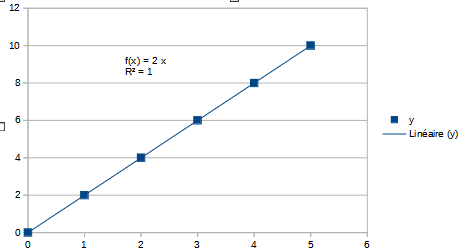
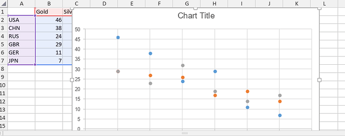
Hi Alexandre, thank you for your answer. Sorry my english, yes I mean scatter charts. Here an illustration.

Hi Alexandre and thank you for responding. I didn’t want to connect the dots, I would like to plot a “statistical regression”, which draw a line or a curve by computing the best way based on the coordinates of the dots. Calc and Excel do that, but nerve mind, I can use those apps for this specific task.
Best regards.
Dear @BZFK
Would you mind pointing me to the documentation of this feature on other editors (or just record a video file with that feature)? It would help us review it.
Dear Alexandre, here is a video capture I have done with Libre Office Calc.
Best regards
cinnamon-2024-11-14T194109+0100.mkv (957.7 KB)
Thank you for the video file!
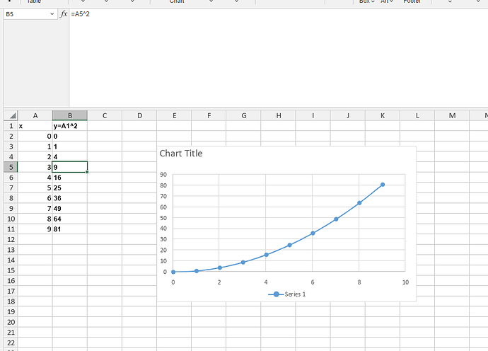
However, I’m a little bit confused, because I believe I have achieved the same result with our charts:
Please clarify where I maid a mistake.
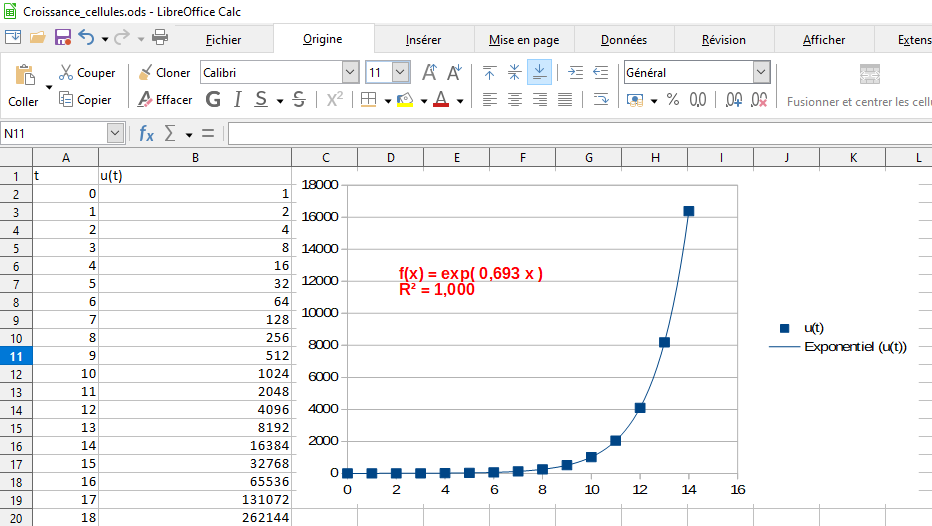
Hi Alexandre, thank you for your help. Indeed, I can draw a curve line between dots, but I think it’s not the regression curve computed by statistics. This regression curve must have an equation I should be able to display, but I don’t find this function.
See the example with MS Excel.
Best regards
Thank you for the clarification, we are checking the request.
Dear @BZFK
We have added your request to internal tracksystem and we have started working on it. I will update this thread once we have something to share.


