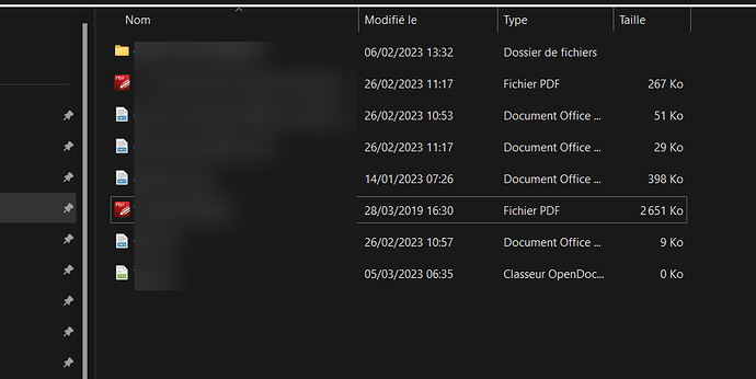
Currently, when you have a small screen with a big resolution and that you use the “detailed list” display mode in the file explorer, it’s very hard to distinguish what kind of file is in a folder.
That’s because only a small part of the icon is coloured, moreover with light colours:
I might be wrong but I think it was the same with LO and in version 7.5 then changed the icon set for a more contrasted one.
Would it be possible for you to consider such a change ?
My (not so old yet) eyes thank you

